Enhancing the caregivers experience
Family caregivers play an important role in supporting loved ones living in long-term care, but finding the right information or knowing who to contact can be challenging.
Client :
St. Joseph's Lifecare Centre
Industry :
Healthcare, Long term care
Focus :
Caregiver Communication
My Role :
Service Design, Researcher

1. Overview
Our team partnered with St. Joseph's Lifecare Centre to better understand the caregiver experience and explore how communication and access to information could be improved. Through service design research and iterative testing, our work led to an interactive kiosk that brought important information and common tasks together in one place.
My role
I worked as one of the Service Design Researchers on the team, with research as my main focus. I helped plan and conduct research, synthesize findings, and translate what we learned into design opportunities.
Like the rest of the team, I wore different hats throughout the project and also contributed to personas, service blueprinting, ideation, prototyping, and usability testing
| Before exploring solutions, we first needed to understand how caregivers found information, communicated with staff, and experienced the service.

2. Understanding the Current Experience
We looked beyond the kiosk to understand what it was actually like to support a loved one in long-term care.
Research at a Glance
9 caregiver interviews
5 focus group participants
1 walk-and-talk observation
14 research papers reviewed
We also reviewed caregiver survey findings and background research to understand the wider context.
What We Wanted to Understand
The caregiver experience
What was it like to support a loved one in long-term care?
Communication and information
How did caregivers stay informed, find answers, and communicate with staff?
Opportunities for improvement
Where could caregivers be better supported?
Interviews helped us understand individual experiences, while the focus group surfaced shared perspectives and emotions. Observation helped us understand the physical environment, while existing research provided broader context.
| Across these different perspectives, recurring patterns began to emerge.

3.What We Learned
Through thematic analysis, two broader themes became particularly important in shaping the direction of the project.
A. Communication and relationships shaped how caregivers stayed connected
Caregivers relied on staff for questions, updates, and reassurance, but our research surfaced challenges such as difficulty reaching staff, outdated information, and information spread across different channels and physical locations.
Relationships mattered too. Caregivers valued familiar staff who knew their loved ones, while staffing changes could make it harder to know who to approach.
What this meant for us
There was an opportunity to make useful information and points of contact easier to access while supporting the relationships caregivers already valued.
B. Caregiving was both meaningful and emotionally demanding
Caregivers found meaning in supporting their loved ones and valued positive relationships with staff. At the same time, they described worry, frustration, and the emotional demands of supporting someone whose health was changing.
What this meant for us
The experience needed to be clear, accessible, and easy to use, particularly when caregivers might already be navigating stressful situations.
| Together, these findings showed us that improving the experience was not simply about providing more information. We needed to understand where that information belonged within the broader service.

4. Defining the Opportunity
We translated our research into personas and a service blueprint to understand different caregiver needs and see how communication challenges appeared across the wider service.
Personas
Our personas brought together recurring behaviours, needs, and challenges so we could consider different caregiver perspectives rather than designing around one experience.


Looking Across the Service
We mapped the caregiver journey alongside the people, interactions, and processes supporting it. This helped us look beyond individual touchpoints and understand how communication challenges connected to the broader service experience.

Where Could We Make a Difference?
How might we help caregivers more easily access the information and support they need while visiting a loved one in long-term care?
|With a clearer opportunity in mind, we began exploring possible solutions.
5. Exploring Solutions
Through collaborative ideation, we explored different ways to respond to the needs identified through our research.

Our First Direction
Our initial concept focused on placing caregiver information boards in resident rooms. When we shared the idea with St. Joseph's, we learned that much of this information already existed across the centre.
More importantly, staff would need to manually maintain boards across many rooms and floors. With staff already managing heavy workloads and staffing challenges, the client raised concerns that this would not be operationally sustainable.
This shifted our thinking from creating more information touchpoints to bringing existing information together in one accessible place.
|That realization led us toward the Caregiver and Family Kiosk.
6. Evolving the Design
Before designing the interface in detail, we used storyboards to test the kiosk concept with caregivers.

What Caregivers Told Us
The core information was useful
Caregivers responded positively to the daily staff list, FAQ, contact directory, and COVID-19 screener.
We had missed useful information
Participants suggested outbreak notices, meal times, and reception or calling hours.
A physical kiosk had limitations
Caregivers raised concerns about crowding and expressed interest in accessing information from home.
This feedback helped us refine the concept before translating it into an interactive prototype.
|The next question was whether caregivers could actually navigate and use the interface as easily as we intended.
Testing & Refinement
We tested a medium-fidelity prototype with six caregivers, who completed four tasks while thinking aloud.
Rather than documenting every usability issue, we focused on the findings that most influenced the final experience.
A. Similar sections were difficult to distinguish
What we found
Caregivers had difficulty differentiating between Today's Care Team, Contact Directory, and Roles List
What we changed
We refined home screen labels and descriptions so the purpose of each section was clearer.
Before
After


B. Interactive elements did not always look interactive
What we found
Some interface elements did not clearly communicate that they could be selected.
What we changed
We introduced stronger visual cues, including drop shadows.
Before
After


C. Accessibility needed to extend beyond visual design
What we found
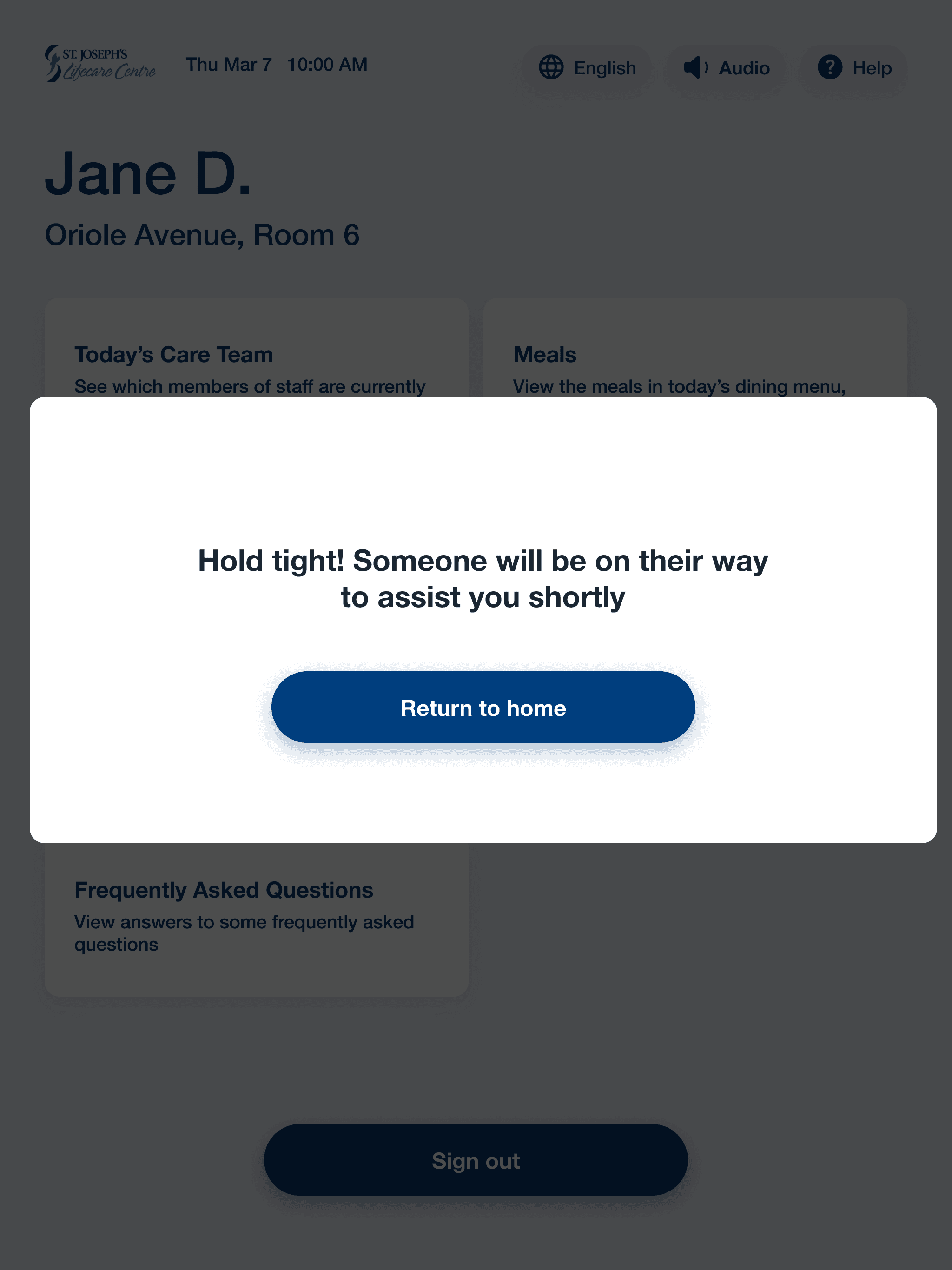
Our research highlighted considerations around changes in vision and hand dexterity. Testing also surfaced needs for language options, easier access to help, and alternatives for interacting with the touchscreen.
What we changed
We added accessibility options, a help button, increased touchscreen sensitivity, and stylus support. The interface also used a minimum 20px font size, 7:1 contrast ratio, and sans-serif typography.

D. The physical kiosk needed faster, more flexible interactions
What we found
Caregivers liked the quicker digital COVID-19 screener but raised concerns about crowding around a shared kiosk.
What we changed
Returning caregivers could scan a barcode rather than repeatedly entering their information. We also incorporated a printing feature so caregivers could take information with them.


E. Urgent health information needed greater visibility
What we found
Caregivers wanted the outbreak notice to be more prominent and informative.
What we changed
We increased its visual prominence, added more detail, and surfaced it earlier so caregivers could make an informed decision about whether to continue their visit.
Before
After


8.The Final Solution
Bringing caregiver information together in one place
The final concept brought together information and common tasks caregivers could use during visits to St. Joseph's. Frequently asked questions, meals, activities, notices, and other resources were brought together rather than spread across separate touchpoints. Caregivers could also print information to take with them.
Staying connected to care
Caregivers could view their loved one's daily care team, understand staff roles, and find contact information in one place.
Supporting a smoother check-in
Returning caregivers could scan their barcode, complete the COVID-19 screening process digitally, and see outbreak information before continuing their visit.
Designing for different needs
The kiosk incorporated larger text, high contrast, accessibility and language options, touchscreen sensitivity, help functionality, and stylus support.

reflection
This project taught me that a solution can respond to user needs and still fall short if it does not work for the people responsible for delivering and maintaining the service. Considering both caregiver needs and operational realities ultimately pushed us toward a more practical, centralized solution.
If I Could Take It Further
With more time, I would explore how the experience could extend beyond the physical kiosk, particularly since caregivers raised concerns about crowding and expressed interest in accessing information from home. I would also continue testing the kiosk's physical accessibility with a wider range of caregivers.
The project reinforced an important lesson for me:
Good service design means looking beyond a single touchpoint and understanding the people, processes, and constraints around it.
Enhancing the caregivers experience
Family caregivers play an important role in supporting loved ones living in long-term care, but finding the right information or knowing who to contact can be challenging.
Client :
St. Joseph's Lifecare Centre
Industry :
Healthcare, Long term care
Focus :
Caregiver Communication
My Role :
Service Design, Researcher
1. Overview
Our team partnered with St. Joseph's Lifecare Centre to better understand the caregiver experience and explore how communication and access to information could be improved. Through service design research and iterative testing, our work led to an interactive kiosk that brought important information and common tasks together in one place.
My role
I worked as one of the Service Design Researchers on the team, with research as my main focus. I helped plan and conduct research, synthesize findings, and translate what we learned into design opportunities.
Like the rest of the team, I wore different hats throughout the project and also contributed to personas, service blueprinting, ideation, prototyping, and usability testing
| Before exploring solutions, we first needed to understand how caregivers found information, communicated with staff, and experienced the service.
2. Understanding the Current Experience
We looked beyond the kiosk to understand what it was actually like to support a loved one in long-term care.
Research at a Glance
9 caregiver interviews
5 focus group participants
1 walk-and-talk observation
14 research papers reviewed
We also reviewed caregiver survey findings and background research to understand the wider context.
What We Wanted to Understand
The caregiver experience
What was it like to support a loved one in long-term care?
Communication and information
How did caregivers stay informed, find answers, and communicate with staff?
Opportunities for improvement
Where could caregivers be better supported?
Interviews helped us understand individual experiences, while the focus group surfaced shared perspectives and emotions. Observation helped us understand the physical environment, while existing research provided broader context.
| Across these different perspectives, recurring patterns began to emerge.
3.What We Learned
Through thematic analysis, two broader themes became particularly important in shaping the direction of the project.
A. Communication and relationships shaped how caregivers stayed connected
Caregivers relied on staff for questions, updates, and reassurance, but our research surfaced challenges such as difficulty reaching staff, outdated information, and information spread across different channels and physical locations.
Relationships mattered too. Caregivers valued familiar staff who knew their loved ones, while staffing changes could make it harder to know who to approach.
What this meant for us
There was an opportunity to make useful information and points of contact easier to access while supporting the relationships caregivers already valued.
B. Caregiving was both meaningful and emotionally demanding
Caregivers found meaning in supporting their loved ones and valued positive relationships with staff. At the same time, they described worry, frustration, and the emotional demands of supporting someone whose health was changing.
What this meant for us
The experience needed to be clear, accessible, and easy to use, particularly when caregivers might already be navigating stressful situations.
| Together, these findings showed us that improving the experience was not simply about providing more information. We needed to understand where that information belonged within the broader service.
4. Defining the Opportunity
We translated our research into personas and a service blueprint to understand different caregiver needs and see how communication challenges appeared across the wider service.
Personas
Our personas brought together recurring behaviours, needs, and challenges so we could consider different caregiver perspectives rather than designing around one experience.
Looking Across the Service
We mapped the caregiver journey alongside the people, interactions, and processes supporting it. This helped us look beyond individual touchpoints and understand how communication challenges connected to the broader service experience.
Where Could We Make a Difference?
How might we help caregivers more easily access the information and support they need while visiting a loved one in long-term care?
|With a clearer opportunity in mind, we began exploring possible solutions.
5. Exploring Solutions
Through collaborative ideation, we explored different ways to respond to the needs identified through our research.
Our First Direction
Our initial concept focused on placing caregiver information boards in resident rooms. When we shared the idea with St. Joseph's, we learned that much of this information already existed across the centre.
More importantly, staff would need to manually maintain boards across many rooms and floors. With staff already managing heavy workloads and staffing challenges, the client raised concerns that this would not be operationally sustainable.
This shifted our thinking from creating more information touchpoints to bringing existing information together in one accessible place.
|That realization led us toward the Caregiver and Family Kiosk.
6. Evolving the Design
Before designing the interface in detail, we used storyboards to test the kiosk concept with caregivers.
What Caregivers Told Us
The core information was useful
Caregivers responded positively to the daily staff list, FAQ, contact directory, and COVID-19 screener.
We had missed useful information
Participants suggested outbreak notices, meal times, and reception or calling hours.
A physical kiosk had limitations
Caregivers raised concerns about crowding and expressed interest in accessing information from home.
This feedback helped us refine the concept before translating it into an interactive prototype.
|The next question was whether caregivers could actually navigate and use the interface as easily as we intended.
Testing & Refinement
We tested a medium-fidelity prototype with six caregivers, who completed four tasks while thinking aloud.
Rather than documenting every usability issue, we focused on the findings that most influenced the final experience.
A. Similar sections were difficult to distinguish
What we found
Caregivers had difficulty differentiating between Today's Care Team, Contact Directory, and Roles List
What we changed
We refined home screen labels and descriptions so the purpose of each section was clearer.
Before
After
B. Interactive elements did not always look interactive
What we found
Some interface elements did not clearly communicate that they could be selected.
What we changed
We introduced stronger visual cues, including drop shadows.
Before
After
C. Accessibility needed to extend beyond visual design
What we found
Our research highlighted considerations around changes in vision and hand dexterity. Testing also surfaced needs for language options, easier access to help, and alternatives for interacting with the touchscreen.
What we changed
We added accessibility options, a help button, increased touchscreen sensitivity, and stylus support. The interface also used a minimum 20px font size, 7:1 contrast ratio, and sans-serif typography.
D. The physical kiosk needed faster, more flexible interactions
What we found
Caregivers liked the quicker digital COVID-19 screener but raised concerns about crowding around a shared kiosk.
What we changed
Returning caregivers could scan a barcode rather than repeatedly entering their information. We also incorporated a printing feature so caregivers could take information with them.
E. Urgent health information needed greater visibility
What we found
Caregivers wanted the outbreak notice to be more prominent and informative.
What we changed
We increased its visual prominence, added more detail, and surfaced it earlier so caregivers could make an informed decision about whether to continue their visit.
Before
After
8.The Final Solution
Bringing caregiver information together in one place
The final concept brought together information and common tasks caregivers could use during visits to St. Joseph's. Frequently asked questions, meals, activities, notices, and other resources were brought together rather than spread across separate touchpoints. Caregivers could also print information to take with them.
Staying connected to care
Caregivers could view their loved one's daily care team, understand staff roles, and find contact information in one place.
Supporting a smoother check-in
Returning caregivers could scan their barcode, complete the COVID-19 screening process digitally, and see outbreak information before continuing their visit.
Designing for different needs
The kiosk incorporated larger text, high contrast, accessibility and language options, touchscreen sensitivity, help functionality, and stylus support.
reflection
This project taught me that a solution can respond to user needs and still fall short if it does not work for the people responsible for delivering and maintaining the service. Considering both caregiver needs and operational realities ultimately pushed us toward a more practical, centralized solution.
If I Could Take It Further
With more time, I would explore how the experience could extend beyond the physical kiosk, particularly since caregivers raised concerns about crowding and expressed interest in accessing information from home. I would also continue testing the kiosk's physical accessibility with a wider range of caregivers.
The project reinforced an important lesson for me:
Good service design means looking beyond a single touchpoint and understanding the people, processes, and constraints around it.
Enhancing the caregivers experience
Family caregivers play an important role in supporting loved ones living in long-term care, but finding the right information or knowing who to contact can be challenging.
Client :
St. Joseph's Lifecare Centre
Industry :
Healthcare, Long term care
Focus :
Caregiver Communication
My Role :
Service Design, Researcher
1. Overview
Our team partnered with St. Joseph's Lifecare Centre to better understand the caregiver experience and explore how communication and access to information could be improved. Through service design research and iterative testing, our work led to an interactive kiosk that brought important information and common tasks together in one place.
My role
I worked as one of the Service Design Researchers on the team, with research as my main focus. I helped plan and conduct research, synthesize findings, and translate what we learned into design opportunities.
Like the rest of the team, I wore different hats throughout the project and also contributed to personas, service blueprinting, ideation, prototyping, and usability testing
| Before exploring solutions, we first needed to understand how caregivers found information, communicated with staff, and experienced the service.
2. Understanding the Current Experience
We looked beyond the kiosk to understand what it was actually like to support a loved one in long-term care.
Research at a Glance
9 caregiver interviews
5 focus group participants
1 walk-and-talk observation
14 research papers reviewed
We also reviewed caregiver survey findings and background research to understand the wider context.
What We Wanted to Understand
The caregiver experience
What was it like to support a loved one in long-term care?
Communication and information
How did caregivers stay informed, find answers, and communicate with staff?
Opportunities for improvement
Where could caregivers be better supported?
Interviews helped us understand individual experiences, while the focus group surfaced shared perspectives and emotions. Observation helped us understand the physical environment, while existing research provided broader context.
| Across these different perspectives, recurring patterns began to emerge.
3.What We Learned
Through thematic analysis, two broader themes became particularly important in shaping the direction of the project.
A. Communication and relationships shaped how caregivers stayed connected
Caregivers relied on staff for questions, updates, and reassurance, but our research surfaced challenges such as difficulty reaching staff, outdated information, and information spread across different channels and physical locations.
Relationships mattered too. Caregivers valued familiar staff who knew their loved ones, while staffing changes could make it harder to know who to approach.
What this meant for us
There was an opportunity to make useful information and points of contact easier to access while supporting the relationships caregivers already valued.
B. Caregiving was both meaningful and emotionally demanding
Caregivers found meaning in supporting their loved ones and valued positive relationships with staff. At the same time, they described worry, frustration, and the emotional demands of supporting someone whose health was changing.
What this meant for us
The experience needed to be clear, accessible, and easy to use, particularly when caregivers might already be navigating stressful situations.
| Together, these findings showed us that improving the experience was not simply about providing more information. We needed to understand where that information belonged within the broader service.
4. Defining the Opportunity
We translated our research into personas and a service blueprint to understand different caregiver needs and see how communication challenges appeared across the wider service.
Personas
Our personas brought together recurring behaviours, needs, and challenges so we could consider different caregiver perspectives rather than designing around one experience.
Looking Across the Service
We mapped the caregiver journey alongside the people, interactions, and processes supporting it. This helped us look beyond individual touchpoints and understand how communication challenges connected to the broader service experience.
Where Could We Make a Difference?
How might we help caregivers more easily access the information and support they need while visiting a loved one in long-term care?
|With a clearer opportunity in mind, we began exploring possible solutions.
5. Exploring Solutions
Through collaborative ideation, we explored different ways to respond to the needs identified through our research.
Our First Direction
Our initial concept focused on placing caregiver information boards in resident rooms. When we shared the idea with St. Joseph's, we learned that much of this information already existed across the centre.
More importantly, staff would need to manually maintain boards across many rooms and floors. With staff already managing heavy workloads and staffing challenges, the client raised concerns that this would not be operationally sustainable.
This shifted our thinking from creating more information touchpoints to bringing existing information together in one accessible place.
|That realization led us toward the Caregiver and Family Kiosk.
6. Evolving the Design
Before designing the interface in detail, we used storyboards to test the kiosk concept with caregivers.
What Caregivers Told Us
The core information was useful
Caregivers responded positively to the daily staff list, FAQ, contact directory, and COVID-19 screener.
We had missed useful information
Participants suggested outbreak notices, meal times, and reception or calling hours.
A physical kiosk had limitations
Caregivers raised concerns about crowding and expressed interest in accessing information from home.
This feedback helped us refine the concept before translating it into an interactive prototype.
|The next question was whether caregivers could actually navigate and use the interface as easily as we intended.
Testing & Refinement
We tested a medium-fidelity prototype with six caregivers, who completed four tasks while thinking aloud.
Rather than documenting every usability issue, we focused on the findings that most influenced the final experience.
A. Similar sections were difficult to distinguish
What we found
Caregivers had difficulty differentiating between Today's Care Team, Contact Directory, and Roles List
What we changed
We refined home screen labels and descriptions so the purpose of each section was clearer.
Before
After
B. Interactive elements did not always look interactive
What we found
Some interface elements did not clearly communicate that they could be selected.
What we changed
We introduced stronger visual cues, including drop shadows.
Before
After
C. Accessibility needed to extend beyond visual design
What we found
Our research highlighted considerations around changes in vision and hand dexterity. Testing also surfaced needs for language options, easier access to help, and alternatives for interacting with the touchscreen.
What we changed
We added accessibility options, a help button, increased touchscreen sensitivity, and stylus support. The interface also used a minimum 20px font size, 7:1 contrast ratio, and sans-serif typography.
D. The physical kiosk needed faster, more flexible interactions
What we found
Caregivers liked the quicker digital COVID-19 screener but raised concerns about crowding around a shared kiosk.
What we changed
Returning caregivers could scan a barcode rather than repeatedly entering their information. We also incorporated a printing feature so caregivers could take information with them.
E. Urgent health information needed greater visibility
What we found
Caregivers wanted the outbreak notice to be more prominent and informative.
What we changed
We increased its visual prominence, added more detail, and surfaced it earlier so caregivers could make an informed decision about whether to continue their visit.
Before
After
8.The Final Solution
Bringing caregiver information together in one place
The final concept brought together information and common tasks caregivers could use during visits to St. Joseph's. Frequently asked questions, meals, activities, notices, and other resources were brought together rather than spread across separate touchpoints. Caregivers could also print information to take with them.
Staying connected to care
Caregivers could view their loved one's daily care team, understand staff roles, and find contact information in one place.
Supporting a smoother check-in
Returning caregivers could scan their barcode, complete the COVID-19 screening process digitally, and see outbreak information before continuing their visit.
Designing for different needs
The kiosk incorporated larger text, high contrast, accessibility and language options, touchscreen sensitivity, help functionality, and stylus support.
reflection
This project taught me that a solution can respond to user needs and still fall short if it does not work for the people responsible for delivering and maintaining the service. Considering both caregiver needs and operational realities ultimately pushed us toward a more practical, centralized solution.
If I Could Take It Further
With more time, I would explore how the experience could extend beyond the physical kiosk, particularly since caregivers raised concerns about crowding and expressed interest in accessing information from home. I would also continue testing the kiosk's physical accessibility with a wider range of caregivers.
The project reinforced an important lesson for me:
Good service design means looking beyond a single touchpoint and understanding the people, processes, and constraints around it.